Framing Pattern

Use this pattern to make the more circular product look better than the linear product.
[DARK PATTERN]
Watch the tutorial for this pattern

Downloads
-
The Framing Pattern is a behavioral design pattern that is used in several patterns across all stages of the customer experience.
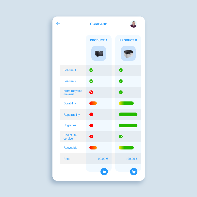
In this product comparison, product B is the more circular product. But it is also more expensive. Both products offer feature 1 and 2. The rest of the features and properties are chosen in a way that makes product B always look better than product A. Like repairability, availability of upgrades and an End of Life Service. These properties make product B more durable and sustainable, but also more expensive.
To make product A look even more inferior, this pattern uses colour in a very persuasive way. For example: Product A is not non recycable, but less recyclable than product B. But in addition to a shorter bar, the bar is also coloured red to yellow, while the bar of product B is coloured yellow to green, making product A look like it has a negative impact, while it only has a less positive impact.
If the pattern would apply the same visual principles to the product price, product A would look much more attractive than product B. But by making this the only property presented in type, it looks kind of neutral.
-
More durable products often are more expensive. Circular properties like manufacturing from recycled materials and repairability are not taken into account by customers enough.
-
The purchase of more durable products reduces the amount of products manufactured and causes less waste.