Energy Efficiency / Customer Journey Stage 03 / Efficiency Framing
Efficiency Framing
Use this patterns to make energy efficiency, repairability and resource consumption the primary evaluation criteria in product comparison.
Why? Once products are placed side by side, users actively evaluate trade-offs and justify their final choice. With this pattern, highly efficient products always “win”.
How it works
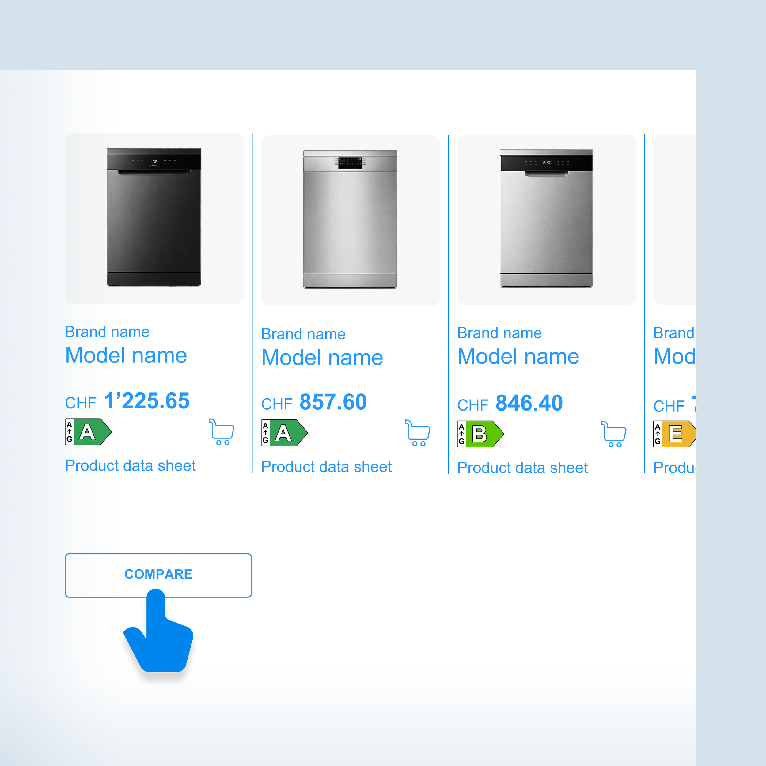
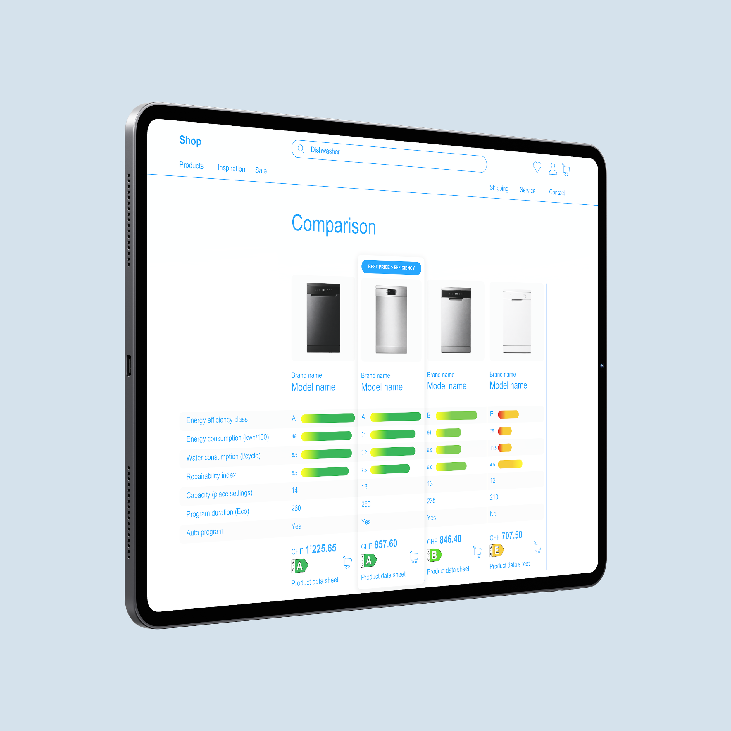
Users enter a comparison view from a product listing.
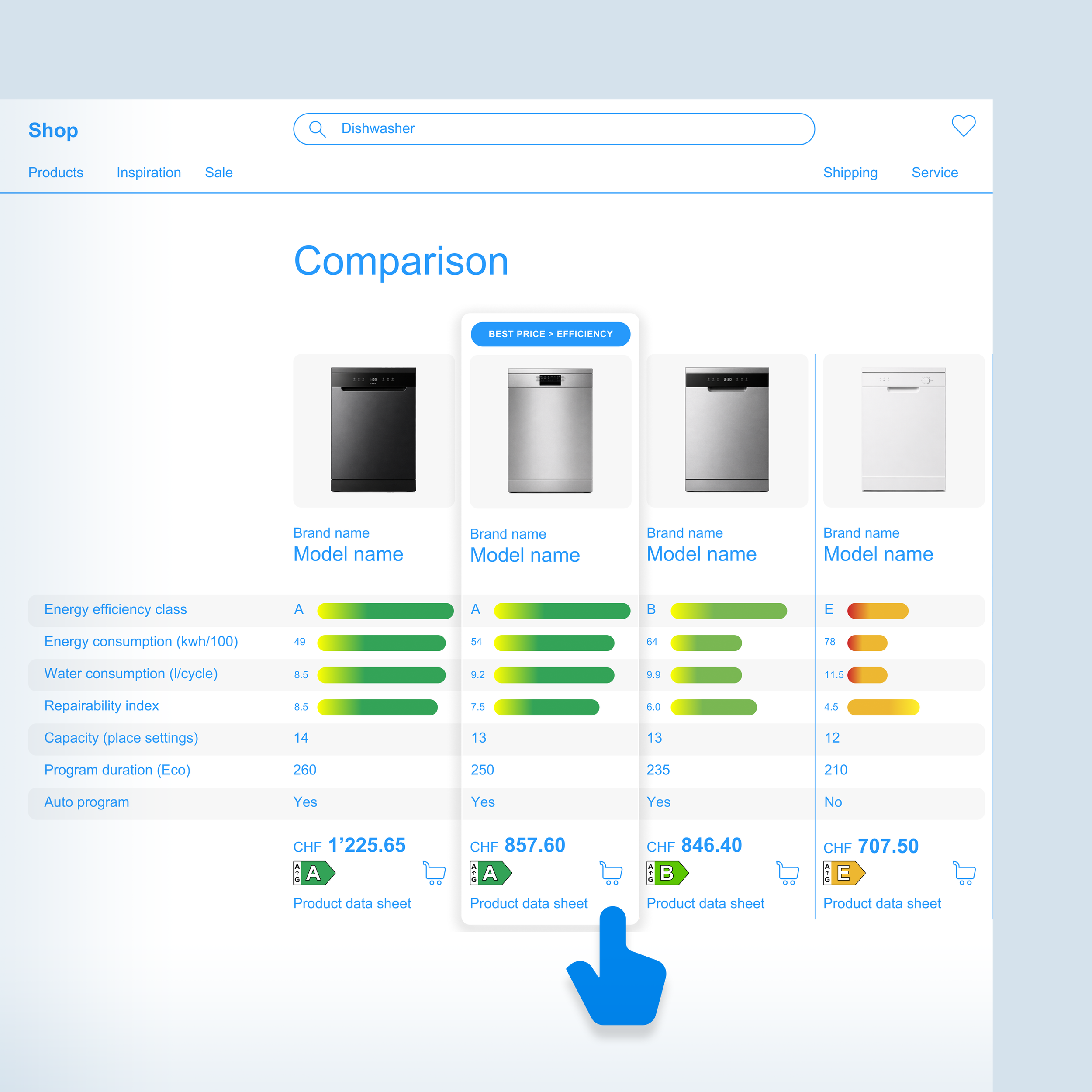
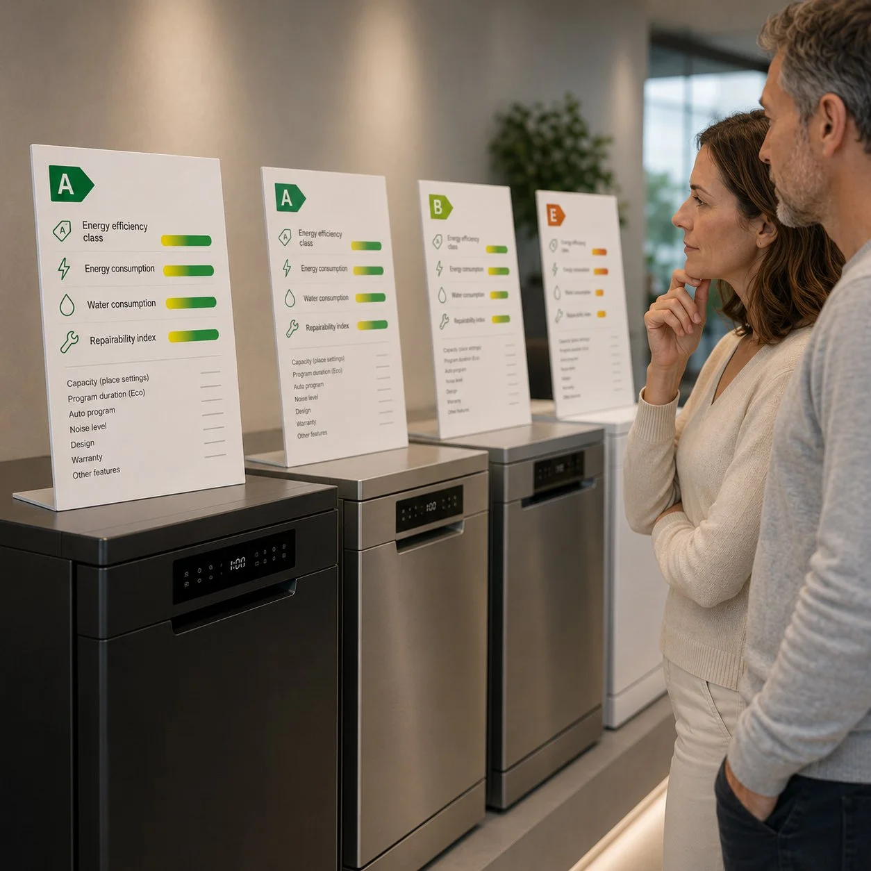
Efficiency-relevant criteria appear at the top of the comparison table, visualized with color-coded performance bars that make differences immediately visible. The product with the best price-to-efficiency performance is highlighted.
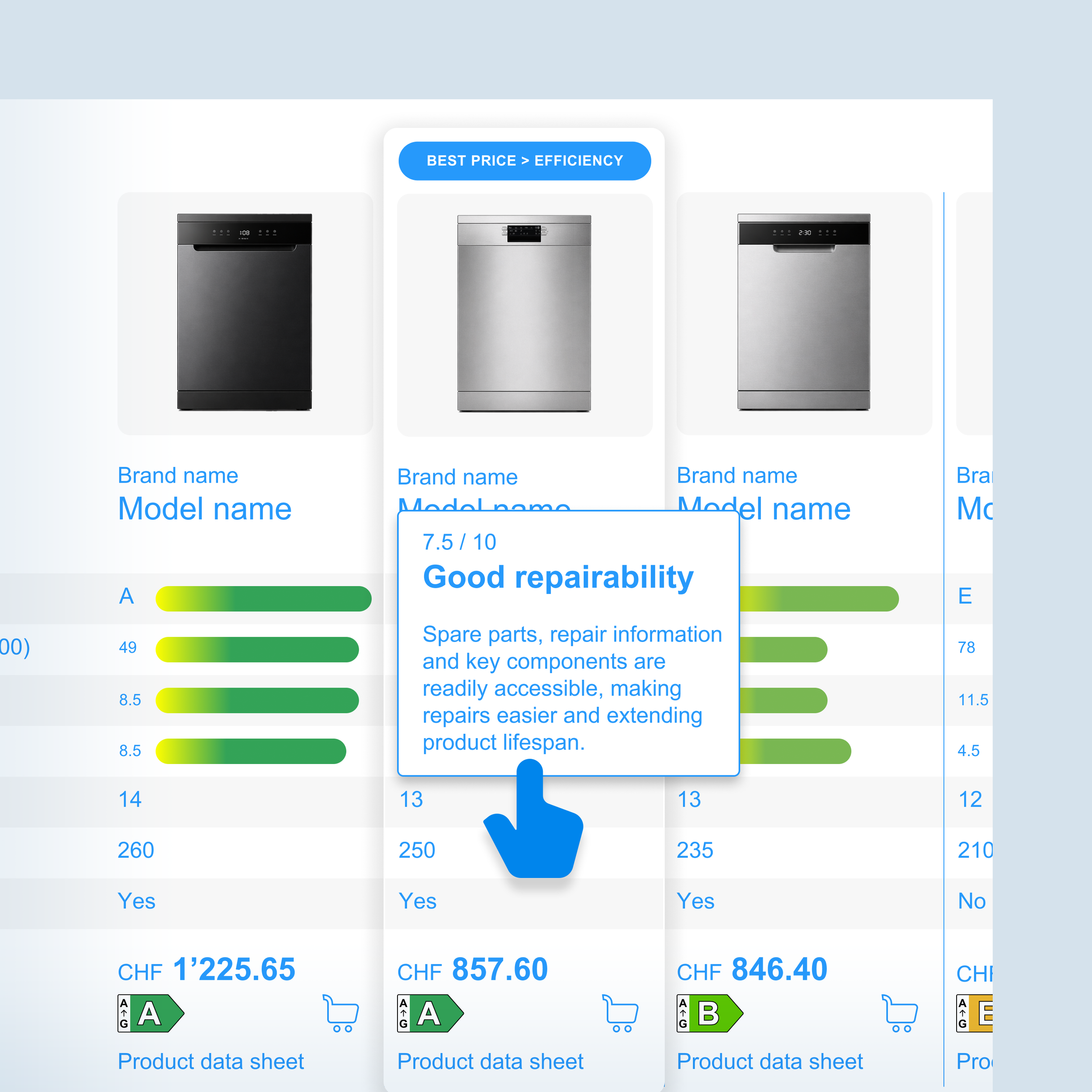
Additional explanations can be accessed through tooltips and information layers, helping users understand unfamiliar metrics.
Persona-Based Evaluation
Based on AI-assisted Personas

Casual Conscious Consumer
Initial perception
The comparison feels easy to understand because the most important information is already organized and visually highlighted. The colored bars immediately draw attention and reduce the need to interpret technical specifications.
Interpretation
The user understands that some products perform better than others without needing deep product knowledge. The repairability information is initially unfamiliar, but the tooltip makes it accessible and credible.
The comparison feels informative rather than educational. The user does not experience pressure but receives useful guidance.
Effect on decision
Makes efficiency differences visible at a glance
Simplifies product evaluation
Increases confidence in selecting higher-efficiency products
Makes repairability a relevant decision criterion
Reduces reliance on purchase price as the only comparison factor
Friction / risks: Low to Medium
Some users may interpret the visual emphasis as a recommendation by the retailer. If the comparison appears too curated or selective, trust may decrease. Transparency about why these criteria are highlighted is therefore important.


Cross-Persona Evaluation
Perceptibility: High
The comparison creates a dedicated decision environment where efficiency-related information is highly visible. Color coding, ranking logic and visual hierarchy make performance differences easy to notice.
Comprehensibility: High
Most users immediately understand that green values indicate better performance. Tooltips help explain unfamiliar concepts such as repairability without overwhelming the interface.
Motivational Fit
High: Committed Caretaker, Casual Conscious Consumer
Medium to High: Progressive Purchaser, Savvy Economizer
Conditional: Novelty Seeker
The pattern works best for users who actively compare products before buying. Users focused mainly on innovation or aesthetics may pay less attention to efficiency indicators unless additional benefits are highlighted.
Decision Impact: Strong
Unlike sorting or filtering patterns, this pattern influences decisions at the moment when alternatives are directly evaluated against each other. It helps users justify choosing a more efficient product even when prices differ.
Risk of Backfire: Low to Medium
Low when the comparison remains transparent, includes all relevant products, and clearly explains the highlighted metrics.
Expert Evaluation
Score: 13 / 14
**************
Cross-Expert Summary
This is the strongest-rated pattern. Experts broadly accepted it because it improves an existing decision moment rather than introducing a separate persuasion layer. The pattern helps users compare efficiency, price and long-term value in one place.
The key requirement is explainability. Experts supported recommendations when users can understand why one product is framed as better. The pattern is therefore highly implementable if it remains transparent and does not hide relevant trade-offs.
“Very strong pattern. And users who want to compare additional attributes will continue further down the comparison table anyway.”
— Director, eCommerce Solutions Provider